Shielder - The Living Brand Identity
SILVER Typography: CampaignCase Film
Case Board

Creative Assets

Agency
Muma Malaysia
Client
Shielder Eco Waste Management
Product/Service
Eco Waste Management
Brief
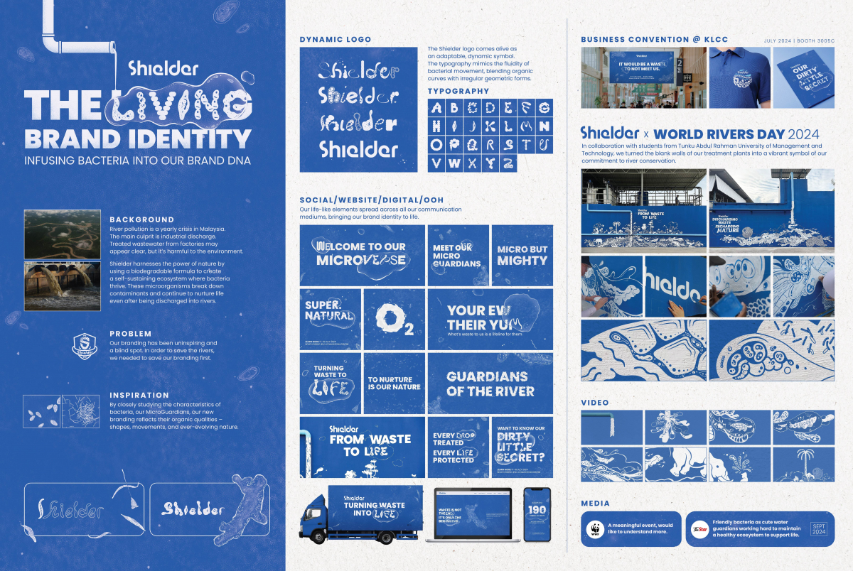
River pollution is a yearly crisis in Malaysia. The main culprit is industrial discharge. Treated wastewater from factories may appear clear, but it’s harmful to the environment.
Shielder harnesses the power of nature by using a biodegradable formula to create a self-sustaining ecosystem where bacteria thrive. These micro-organisms break down contaminants and continue to nurture life even after being discharged into rivers.
However, our branding has been uninspiring and a blind spot.
Solution
The Living Brand Identity. Infusing bacteria into our brand DNA.
In order to save the rivers, we needed to save our branding first. By closely studying the characteristics of bacteria, our MicroGuardians, our new branding reflects their organic qualities – shapes, movements, and ever-evolving nature.
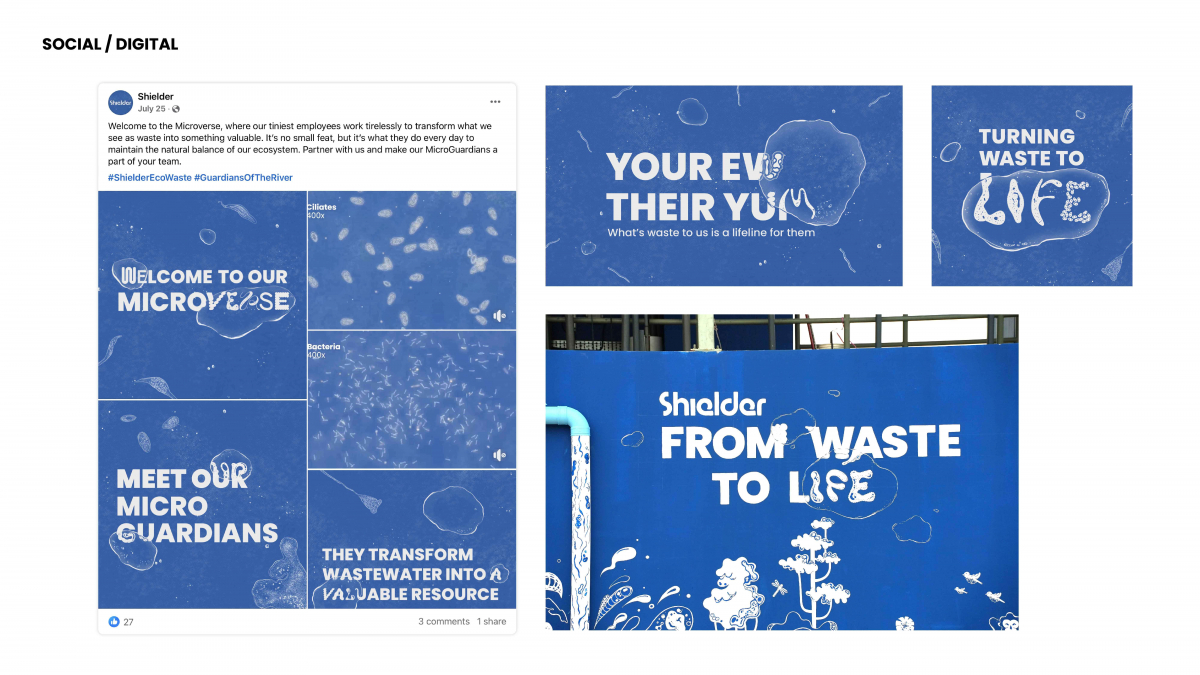
The Shielder logo comes alive as an adaptable, dynamic symbol. The typography mimics the fluidity of bacterial movement, blending organic curves with irregular geometric forms. Our life-like elements spread across all our communication mediums, bringing our brand identity to life.
Credit
Client: Shielder Eco Waste Management
Founder/ Director: Dragon Lee
Personal Assistant: Lim Yi Sheng
Agency: Muma Malaysia
ECD: Choo Chee Wee
Creative Director: Kong Wei Wen
Art Director: Liew Su Anne, Tan Cai Jing
Copywriter: Kong Wei Wen, Ian Lai
Designer: Nicole Lim, Shannon Khor
Motion Designer: Hon Khai Yin
Managing Director: Pang Li Li


