Corezone
BRONZE Best Design - Brand IdentityCase Film
Case Board
School
The One Academy
Lecturer(s)
Ong Chung Ping
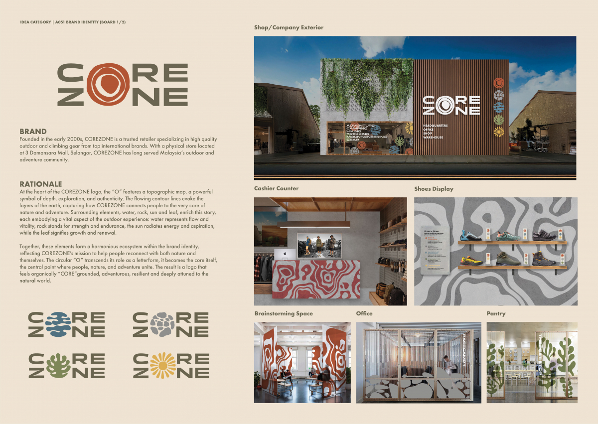
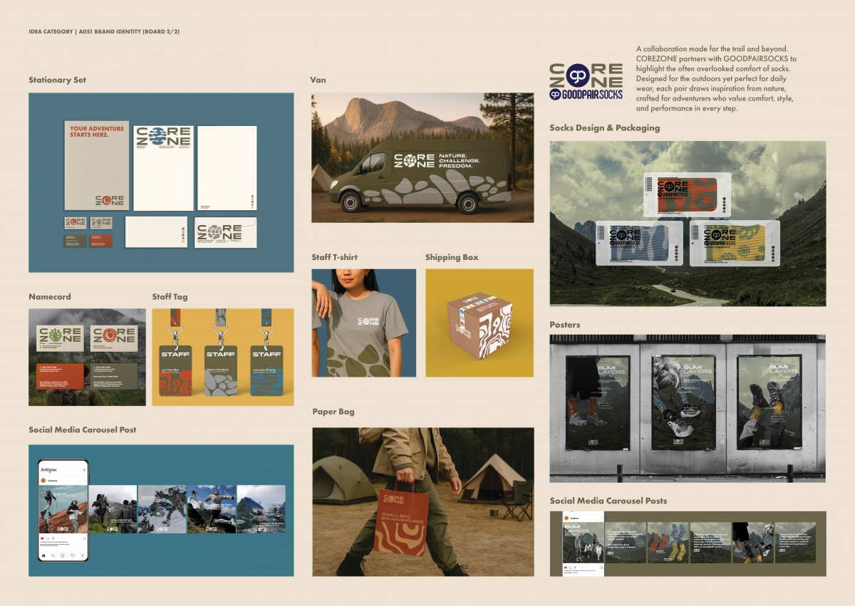
Brand
Corezone
Rational
At the heart of the COREZONE logo, the “O” features a topographic map, a powerful symbol of depth, exploration, and authenticity. The flowing contour lines evoke the layers of the earth, capturing how COREZONE connects people to the very core of nature and adventure. Surrounding elements, water, rock, sun and leaf, enrich this story, each embodying a vital aspect of the outdoor experience: water represents flow and vitality, rock stands for strength and endurance, the sun radiates energy and aspiration, while the leaf signifies growth and renewal. Together, these elements form a harmonious ecosystem within the brand identity, reflecting COREZONE’s mission to help people reconnect with both nature and themselves. The circular “O” transcends its role as a letterform, it becomes the core itself, the central point where people, nature, and adventure unite. The result is a logo that feels organically “CORE” grounded, adventurous, resilient and deeply attuned to the natural world.
Group Members
Lai Yien Bei
Other Credits
-